To our valued Partners, Clients and Team members, This guide is for anyone who wants to use FastTicket's brand assets in their marketing or advertising materials.
The guidelines contained in this manual outline the general rules for proper and consistent application of FastTicket's brand assets, and showcasing FastTicket content.
Consistent use of these assets helps the general public to easily recognize references to FastTicket and protect the brand's trademarks. It is important that your marketing materials use FastTicket standards, and use the brand's approved assets correctly. This guide will help you meet those standards.










Clear Space
To preserve the integrity of the FastTicket Logo, always maintain a minimum clear space around the logo. This clear space insulates our Logo from distracting visual elements, such as other logos, copy, illustrations or photography.



To ensure accurate and consistent use, never alter, rotate, embellish or attempt to recreate the FastTicket Logo. The proportions and shape of the Thumb Icon should never be altered for any reason. To resize, hold the “Shift” key in most software programs to maintain the proportions while scaling up or down. Always maintain the minimum clear space, even when proportionally scaling the logo
Consistency is the key. Always make sure that FastTicket Logo is reproduced in a legible size and that they do not appear subordinate to any other partner logo included on the creative executions. Similarly, do not present the FastTicket Logo in a way that makes it the most distinctive or prominent feature of what you’re creating.


It is permitted to change colour of the whole logo. But it is not permited to change colour of parts of the logo only. Eg the word tickets. You can use any colour as long as its creates a contrast on the background. Our advice is not use colours that are too bright and keep it subtle.


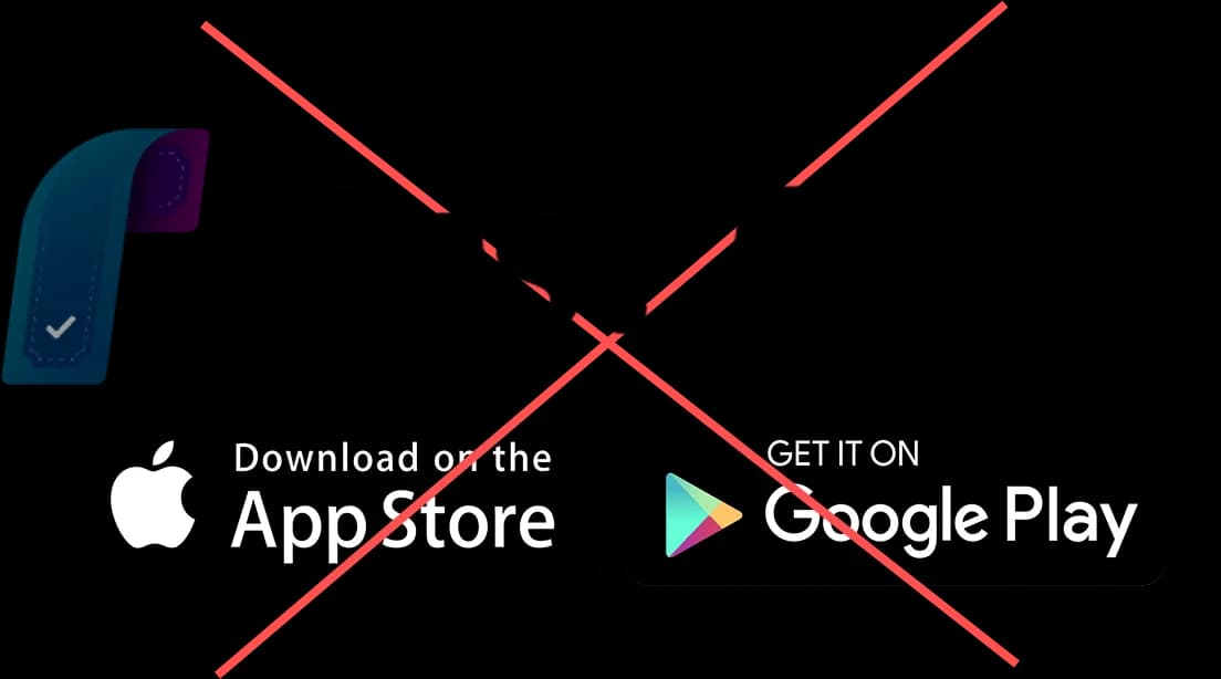
You are allowed to change the colour of the logo so that it's visible on the background, but refrain from changing the colour of it's separate parts. eg word tickets.




avoid over crowding the space beside our logo and make sure it doesn’t touch the edge of your artwork, also make sure to not flip or invert the our logo in any direction that you wish to use it.

To our valued Partners, Clients and Team members, This guide is for anyone who wants to use FastTicket's brand assets in their marketing or advertising materials.
The guidelines contained in this manual outline the general rules for proper and consistent application of FastTicket's brand assets, and showcasing FastTicket content.
Consistent use of these assets helps the general public to easily recognize references to FastTicket and protect the brand's trademarks. It is important that your marketing materials use FastTicket standards, and use the brand's approved assets correctly. This guide will help you meet those standards.
Clear Space
To preserve the integrity of the FastTicket Logo, always maintain a minimum clear space around the logo. This clear space insulates our Logo from distracting visual elements, such as other logos, copy, illustrations or photography.
To ensure accurate and consistent use, never alter, rotate, embellish or attempt to recreate the FastTicket Logo. The proportions and shape of the Thumb Icon should never be altered for any reason. To resize, hold the “Shift” key in most software programs to maintain the proportions while scaling up or down. Always maintain the minimum clear space, even when proportionally scaling the logo
Consistency is the key. Always make sure that FastTicket Logo is reproduced in a legible size and that they do not appear subordinate to any other partner logo included on the creative executions. Similarly, do not present the FastTicket Logo in a way that makes it the most distinctive or prominent feature of what you’re creating.
It is permitted to change colour of the whole logo. But it is not permited to change colour of parts of the logo only. Eg the word tickets. You can use any colour as long as its creates a contrast on the background. Our advice is not use colours that are too bright and keep it subtle.
You are allowed to change the colour of the logo so that it's visible on the background, but refrain from changing the colour of it's separate parts. eg word tickets.
avoid over crowding the space beside our logo and make sure it doesn’t touch the edge of your artwork, also make sure to not flip or invert the our logo in any direction that you wish to use it.